
Habit charts
Read your habits, four ways.
Habit Pocket ships four chart types, and each one answers a different question. Pick the right one and your data starts telling stories instead of sitting in a grid.
01 · Line chart
Trends and correlations.
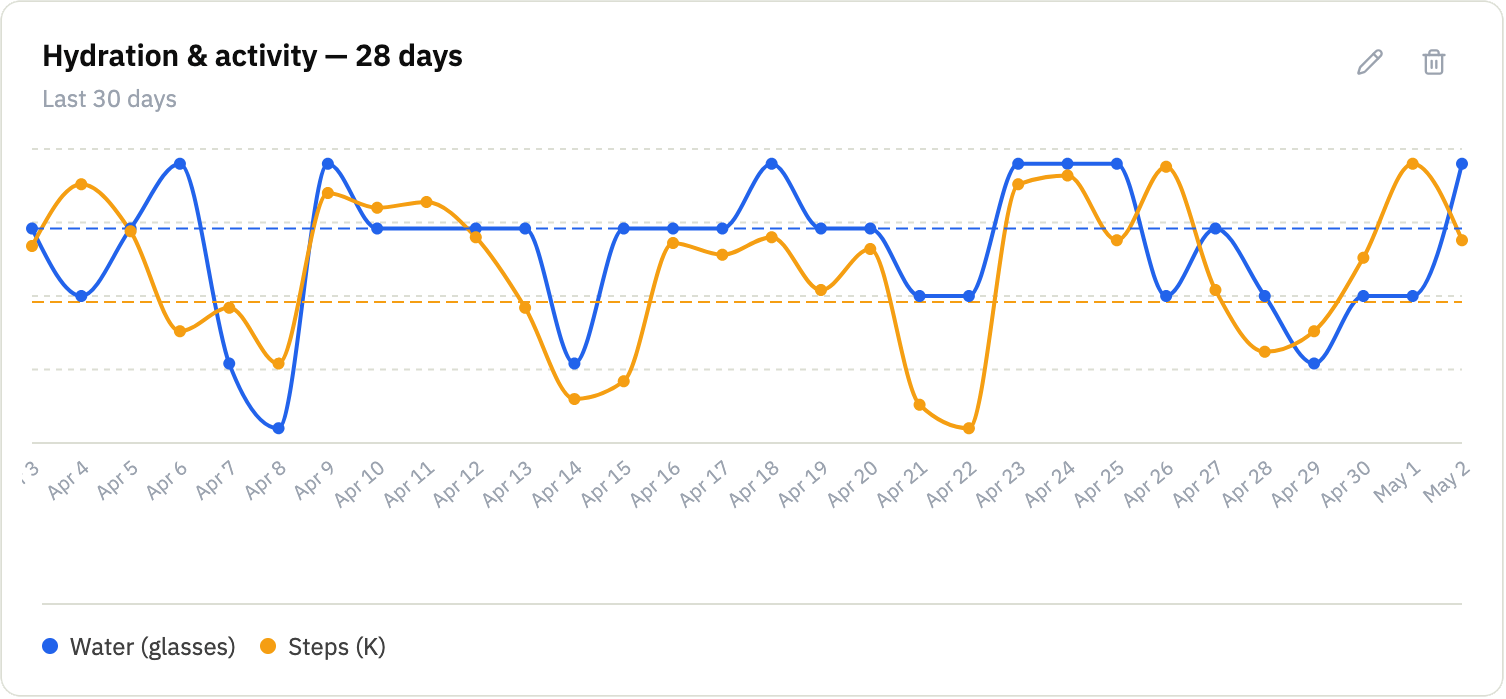
The most flexible chart. Plot one numeric or time habit over time, or stack multiple habits to look for patterns. Does activity track hydration? Does mood follow sleep?
Use cases
- Water and Steps on one chart to see if hydration tracks activity.
- Sleep Score and Mood overlaid to test whether better sleep means better days.
- Weight trend across the last 90 days, with the target as a dashed reference line.
- Wake-up time consistency: is it drifting later on Fridays?
Best for numeric and time habits where you care about the trend, the target line, or how two metrics move together.
02 · Streak heatmap
One square per day.
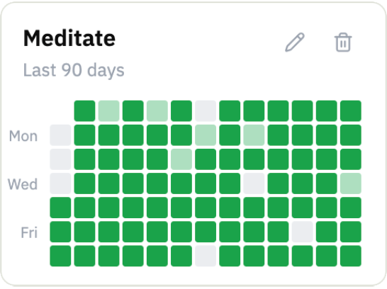
A calendar grid for yes/no habits. Color depth grows with the streak, so a 30-day run looks visibly darker than a 3-day one. Skip days show as a diagonal half-fill so a rest day doesn't look like a miss.
Use cases
- Reading streak across the year: the months you fell off, and the ones you didn't.
- Meditation consistency week-over-week.
- Days you got to the gym, with weekend rest days marked as skips.
- Any "did I show up?" habit where building a streak is the point.
Best for yes/no habits where the question is consistency. If you want a number instead, use a Summary card.
03 · Summary card
One number, big.
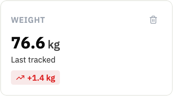
Sometimes you don't want a chart, you want a status. The summary card shows the latest value or the period average, plus the change since last time, either absolute (kg, glasses) or percent (↑ 12%).
Use cases
- Latest weight with the absolute drop or gain.
- Average sleep score for the last seven days.
- Glasses of water yesterday, with the percent change vs the week before.
- A pinned 'where am I now' tile on your dashboard.
Best for glanceable status. When the question is 'where am I right now' and a chart would be overkill.
04 · Candle chart
Paired times, on one axis.
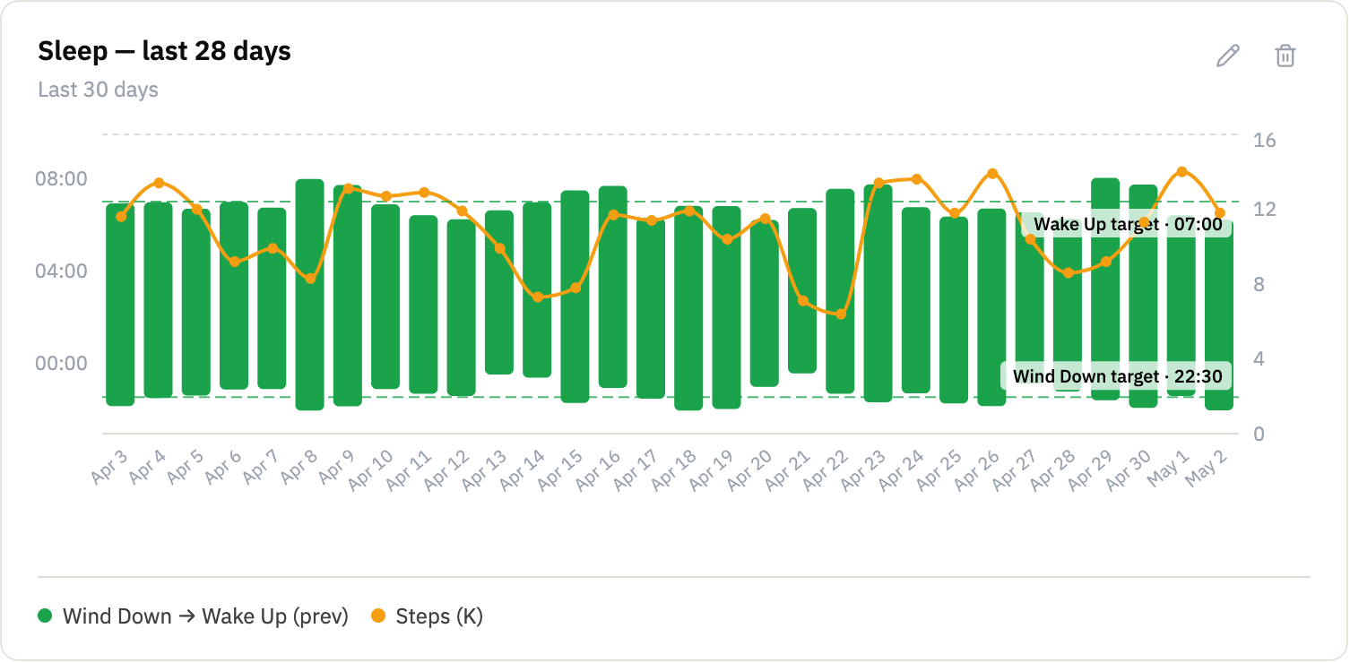
Two times of day on a single chart, with the day-offset that makes overnight spans plot as continuous bars. Designed for sleep, wind-down to wake-up, and it can carry a numeric overlay like steps or a sleep score.
Use cases
- Sleep span: wind-down at 22:30, wake at 07:15, all 28 nights at a glance.
- Add an overlay metric (Steps, Sleep Score, anything) to spot patterns the bars alone would miss.
- Workout window: when you started, when you finished.
- Anything paired by a start and end clock-time you're trying to be consistent about.
Best for paired time-of-day habits where the gap between two times is the metric you care about.
Five habits. Thirty days.
See what shows up.
No credit card. Pick five habits. Come back in a month.